


An increasing percentage of consumer internet access is via mobile devices, driving major growth in mobile search. Search queries on mobile devices grew five-fold in the last two years, according to Google, which has released its own mobile usability guidelines. Meeting these criteria and achieving “Mobile Friendly” status according to Google, helps your traffic and rankings, but how do you achieve this and what other factors do you need to take into consideration?
Firstly, what is Google looking for? Essentially there are five key recommendations:
- Have a defined viewing area that adjusts to fit screen size
- Avoid using software that is not common on mobile devices, such as Flash
- Use text that is readable without zooming
- Size content to screen size so users do not have to zoom or scroll horizontally
- Place links or buttons far enough apart so that the correct one can be tapped easily
Moving beyond Mobile Friendly
However meeting these criteria and becoming Mobile Friendly should be treated as a basic start point for optimising your site for Google. What is more complex, and more difficult to achieve, is to rank highly in searches on mobile devices. Since 2012, Searchmetrics has analysed the ranking factors that correlate with high placings in organic search results. This has now been extended to include analysis of mobile search results, looking at which factors are the same (as for desktop and laptop results) and which vary.
The key point is that there are major differences between the results that search engines deliver on phones and computers. Our data, from the Searchmetrics Google Rank Correlation and Ranking Factors 2014 study, found that 36% of web pages (URLs) shown in mobile Google search results are different to those that appear for the same searches carried out on a desktop or laptop. Nearly a quarter (23%) were from completely different websites (domains).
This reflects Google’s increasing focus on the context and intent behind queries, which varies dramatically between devices. In many ways this is obvious – if you are searching for Thai food on your desktop PC you could be looking for recipes or restaurants. But if you search on a mobile device you are much more likely to be looking for restaurants – and in particular those close to where you currently are.
While some important quality factors overlap with desktop features, mobile search has its own characteristics and specific feature differences. We analysed mobile search results for thousands of keywords to determine the factors that correlate with high rankings. The five key findings of our research were:
1. Mobile content is shorter than desktop content
Content on pages that rank well in mobile search results is typically shorter, slightly easier to read, features fewer internal and external links, contains fewer, shorter titles and has less additional media (such as images and video). This may seem obvious, but simplicity is crucial if content is to be consumed quickly on a small screen.
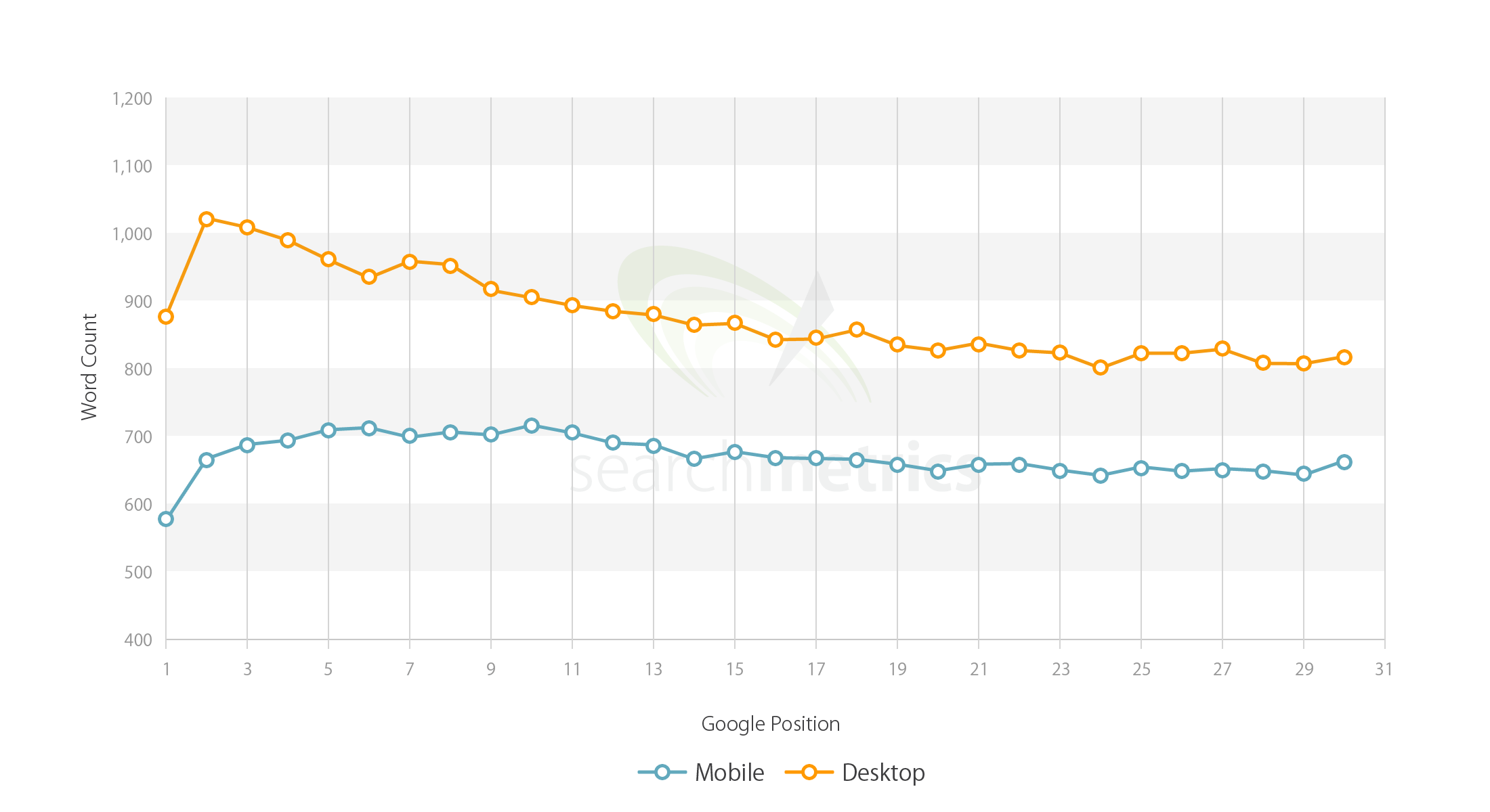
Number of Words in Text for Pages Ranking in Mobile vs. Desktop SERPs
2. Higher ranking URLs feature more relevant and holistic content
Rather than being optimised for single keywords, this means content needs to cover the topic comprehensively and be based on clusters of relevant words. One way of doing this is to look at content in terms of proof terms and relevant terms, as both have a strong positive correlation with high Google rankings. For example, for a search term such as “iPhone 6 plus” proof terms such as “Apple” or “mobile” are words that are strongly related to the primary keyword and highly likely to appear at the same time. Relevant terms such as “bending” or “screen size” are a bit more removed and part of a sub-ordinate topic cluster.
3. Speed is vital
Page loading speed is even more critical for mobile than for desktop. Mobile ranking URLs tend to both be smaller than their desktop equivalents and have a faster average page load time. Again, this makes sense given that searchers on the move are more impatient and want to receive results faster.
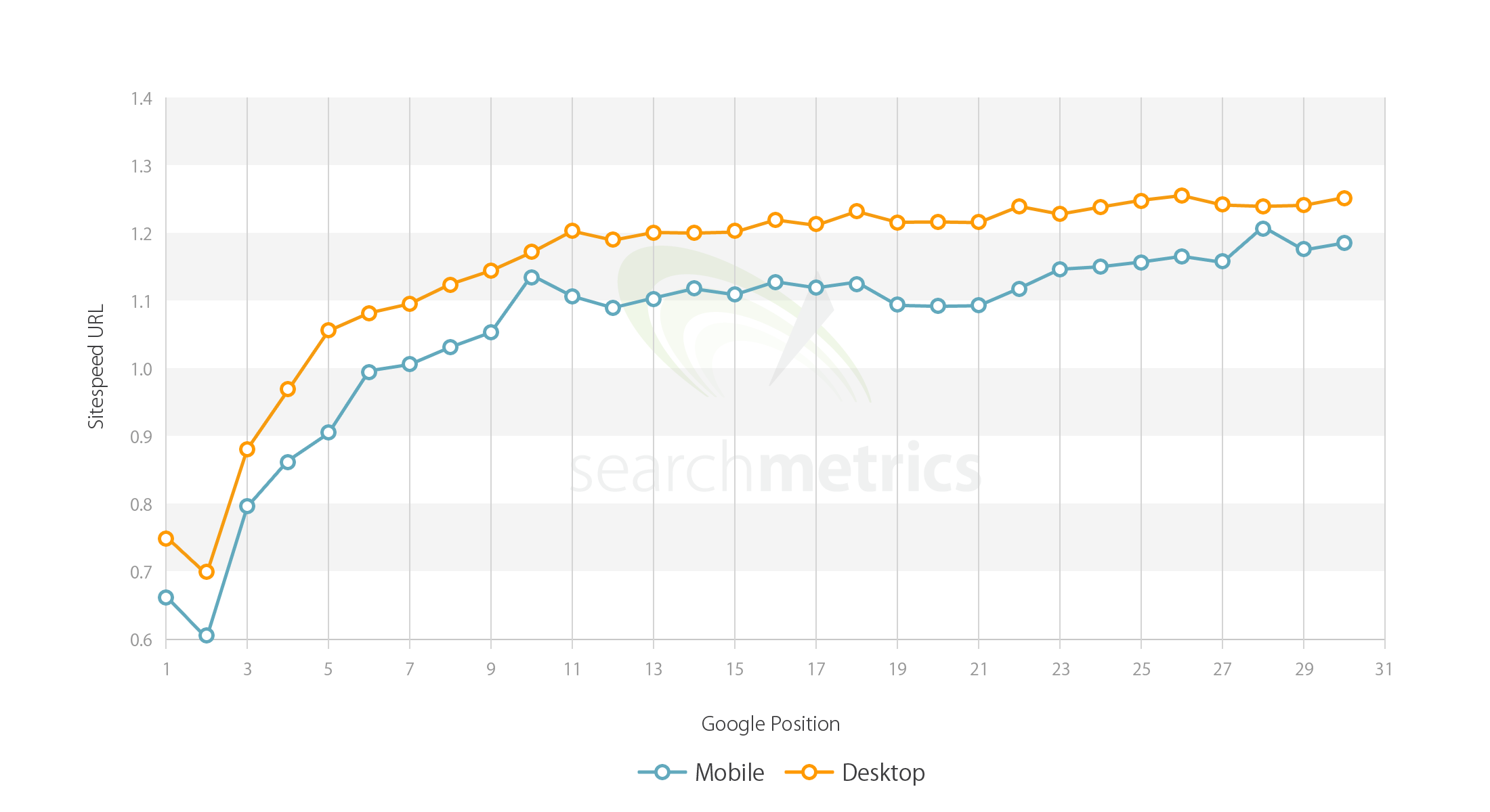
Average Page Load Times for URLs Ranking in Mobile SERPs vs. Desktop SERPs
4. Focus on the user experience
Even before Google began labelling mobile-friendly URLs in search results, few domains used Flash. Additionally there are fewer internal and external links in mobile content, which corresponds with Google’s preference for positioning navigational links far enough apart on the page to be tapped easily.
5. Mobile results show fewer but newer backlinks
Backlinks to your site from other sites (especially high profile news sites or industry blogs for your sector) are viewed by Google as an indication of quality – the more links from high quality sites the more likely your site will rank higher. Our study shows that high ranking mobile pages have fewer backlinks, but they tend to be fresher. Anchor texts within links are shorter; and there are fewer linked keywords. The conclusions are principally the same as for desktop—you need quality backlinks rather than a large quantity of links from lower quality sites.
Underlying all of these factors, the most important principle to bear in mind is that the search intention of the mobile user is often different from that of the desktop user. Therefore to provide a satisfying search experience – and consequently to rank highly in results – marketers need to ensure that they have tailored their site and content to meet the growing needs of mobile.