


Performance marketers and businesses worldwide are searching for one thing – the perfect landing page. A page that converts most people who visit it. One that delivers huge volumes of well-qualified leads and sales.
Unfortunately, every business and site is different and there’s no single “perfect landing page”. So what are the “must-haves” that can help you to turn a dreary homepage to a lead generating machine?
We’ve analysed some of the best landing pages to show you the anatomy of the perfect landing page. The five key things every high-converting landing page should include:
1. Instantly clear what the page is about
You have almost no time to capture your visitor’s attention. Recent research shows people form their first impression of a site within just 50 milliseconds and everyone knows that first impressions stick. Although visitors are willing to scroll, it’s still the “above the fold” content that is most important in creating the user’s first impression.
That means your headline and image must tell the user exactly what it is you do. Ideally, this should be a simple, catchy description of your product or service or a clear definition of the problem you solve. Take rewards service 20Cogs:

The area above the fold is clear, concise and sells the service. They explain both what the benefit is to the visitor and what the service offers. There’s even an extra “bonus” to make the offering more compelling. Anyone who lands on this page will instantly know if they’re in the right place or not.
TIP: Show the ‘above the fold’ section of your landing page to someone who doesn’t know what your product or service is and challenge them to describe it to you. If they can’t do it easily and accurately you need to work on your first impression.
2. Relevant USPs. shared as benefits
One of the oldest and most often overlooked principles of sales and conversion optimisation is to sell benefits rather than features. Users don’t care about the details of what your product can do, they want to know how it solves their actual problems.
To do this well, spend time getting to know your customers. Do your research. Run surveys, listen to sales calls, review chat logs, talk to customers and find out what it is that really bothers them and how your solution helps.
Then present them simply and clearly, just like SproutSocial:
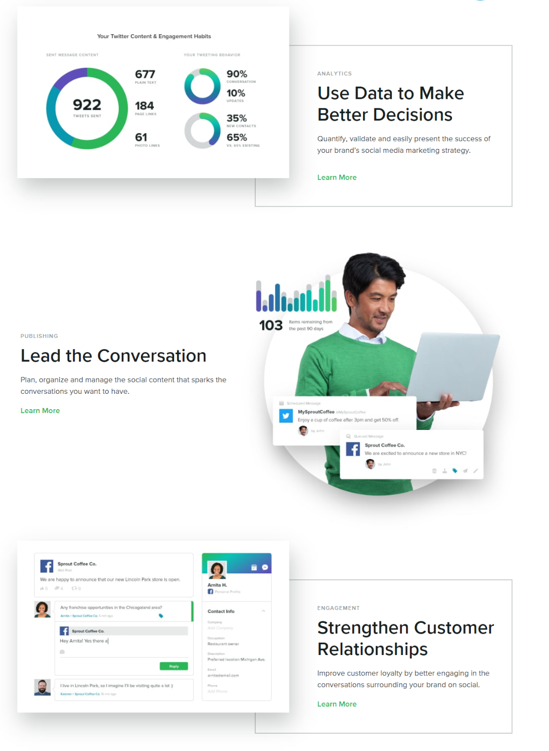
It’s clear exactly how this service can help the user’s business and the problems it solves. The user doesn’t need to guess and, if these have been correctly researched, they’ll immediately think “Yes – that’s something I want to do”.
3. Scannable page with detail for those who need it
People are in a hurry. If your site is good enough to get past that first 50 milliseconds, you’ve got to keep them engaged. Hundreds of session recordings show the same behaviour repeating itself over and over. People scroll down landing pages reading the headlines and key points. They use that to understand whether the service is right for them before going back up and reading the parts that interest them the most.
Airbnb does a fantastic job of this with their host landing page:

There’s a great visual hierarchy with the most important points in the largest fonts. You can read each of the main headlines and understand what you’re going to find out on the page. The subheadings expand on that if you want more detail. If you really want even more detail, there’s a paragraph of text for each to help you out.
TIP: Try reading through just the headlines on your page. Does that tell you enough to understand the offering and are you compelled to continue (or at least read more)? Optimising and writing great headlines can be one of the best uses of time when creating a landing page.
4. Believable social proof
Social proof is vital to any landing page as it’s the best way of building trust in your brand and service. The key to social proof isn’t just sharing big user numbers, name-dropping mega-brands or cherry picking glowing reviews from your best customers.
In reality, the best social proof is genuine, relatable testimonials, case studies and examples from relevant businesses to your customers.
Now TV does this extremely well on their landing page:
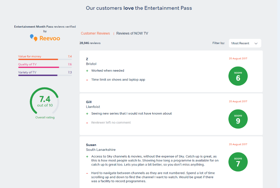
Now TV hasn’t got an outstanding Reevoo score, but they’re confident enough in their product to share the “Most Recent” (not just the best) reviews from a trusted external provider. They’re uncensored and include the bad points as well as the good ones. People can identify with these users. The geographical location of the reviewers helps them to think “that’s someone like me”.
Users are very sophisticated and used to searching for reviews online. They know that if something looks “too good to be true”, it probably is.
Now, If you’ve got a 9.8/10 rating on a trusted review site, shout about it because it really shows value. But for most businesses, just being genuine and sharing this detail can prove to potential customers that this is a product or service worth considering.
5. Be upfront about the cost
Whatever your product, at some point you’re expecting the customer to part with money. In most sectors, users are very price sensitive and will be on the hunt for this information. It doesn’t matter if you’re offering a free trial or selling a physical product, people don’t want to waste their time with something they can’t afford.
Payment processor Square is upfront about their pricing on their landing page:
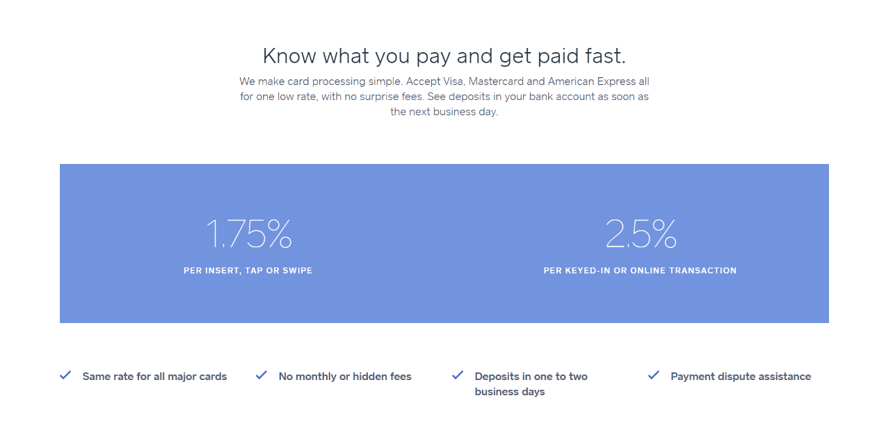
The key is to make sure you’ve convinced users your product or service is good enough to make this pricing seem compelling.
On the landing page the user is still at the early stages of the buying process, but if you don’t mention costs somewhere on your page, they’ll nearly always go elsewhere to look for it. As always, don’t make your users work to find something they need.
Of course, many landing pages are advertising something free – a report, an eBook or a download. If that’s the case, make sure you’re totally upfront about that too in a big way. As Dan Ariely explains in Predictably Irrational, “Free” is a very special price and is far more compelling than even a price of $0.01. By making a big deal of the fact that something is free (and explaining that it’s really free, or any catches), you can significantly increase conversion rates.
The perfect landing page?
So is there a perfect landing page? Even looking at our five great examples, each could be improved in at least one area. Whether that’s Now TV’s lack of scannable headlines, Square’s lack of a clear first impression or Airbnb’s lack of social proof. These pages clearly work well and have been tested heavily but things that work for SproutSocial and Airbnb may not work as well for your brand.
By working from the five elements here and using other landing pages for inspiration, you can give yourself a strong starting point that will convert well. To really create the perfect landing page, though, it’s vital to research your customers and understand exactly what they want. Then test your pages. Try different headlines, different structures, add different elements and try some radical changes.
As you learn more about your customers and test your pages you’ll get closer and closer to your own, unique, perfect landing page.
Join Dave Gowans at PI LIVE for more expert advice on increasing conversion rates in his session “How to Optimise When You Don’t Control the Funnel”.