


By now Google’s working transition to a mobile-first index is hardly breaking news. Google first officially announced its testing of a mobile-first index in November of 2016, which even then could be considered long overdue given mobile search volume exceeded that of desktop back in 2014. Although this is not a new concept, now is crunch time for preparing because Google plans to have it fully implemented during the second half of 2017.
The implication of a mobile-first index is the notion that Google’s main database will soon contain the mobile version of any given web page instead of a desktop version. This means when Google is organising search results for a given query, whether on a mobile or desktop device, the mobile version of a web page will be analysed for inclusion in the search results. The main difference as it applies to webmasters is that it will be much more difficult to rank even in desktop search results if a web page is not mobile-friendly.
That being the case, a website that performs well in desktop search results will likely experience a significant drop in search engine visibility if it is not mobile-friendly as soon as the new index is fully implemented. Those of you still relying on your desktop organic search traffic to drive new business despite more searches happening on mobile devices need to take notice.
While there are multitudes of updates and optimisations that need to happen to be truly competitive in mobile search, this checklist focuses on the “must-haves” that absolutely need to be set in motion to prepare for the shift.
To ensure a seamless transition of your website into a mobile-first Google index, start with these five steps:
- Align all mobile versions of pages with the desktop version.
- Review all directives.
- Review all server responses.
- Check page speed.
- Test for mobile-friendliness.
1. Align all mobile versions of pages with the desktop version
While technically speaking, there are several ways to make a website mobile-friendly, however, nowadays it boils down to being responsive. This is especially the case given the mobile-first index implication that Google will base desktop ranking results on the mobile version of a web page. If a web page is using an alternative mobile method (such as a separate mobile version on an ‘m.’ subdomain), the mobile page may not contain all the content and functionality that the desktop version has. Therefore, a great desktop page may not rank on desktop because Google is judging it based on a limited mobile page.
If a website is not responsive, now is the time for a redesign. Google’s John Mueller made a strong case for making that transition before the mobile index is rolled out in a recent Google Hangout, advising webmasters to complete this transition asap. This will ensure that the canonical version of any page first crawled for the mobile-first index will be constant. Alternatively, if the mobile-first index identifies a canonical page which changes soon after, it becomes similar to performing a site migration and will slow down Google’s ability to index the correct canonical page. Bottom line – move to a responsive template and ensure that any URLs previously on an ‘m.’ subdomain are 301 redirected to the responsive version.
2. Review all directives
The next two checklist items come directly from Google’s Gary Illyes in a recent tweet. Proper housekeeping of on-site directives and redirection rules should always be a priority, but doing so in advance of the mobile-first index is an absolute must.
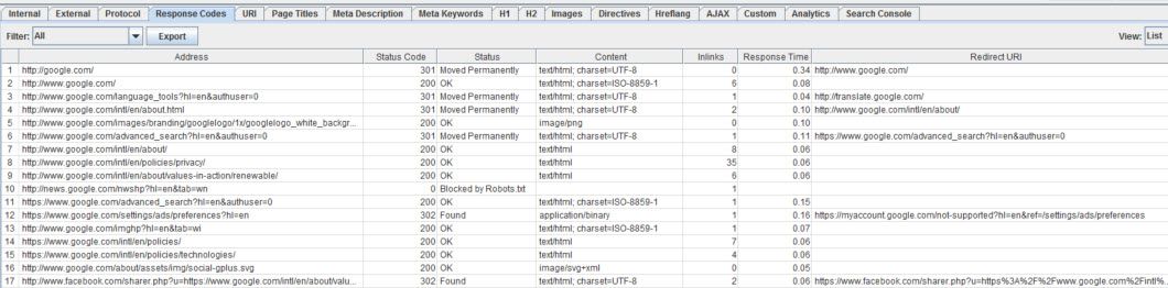
Taking an inventory of all directives is the first step. This can be accomplished with a website crawler such as Screaming Frog. The easiest way to identify issues is to download all website information to a spreadsheet. This will allow you to set filters to find all pages with a ‘noindex’ directive for example.
Review directives to accomplish the following:
- Identify and remove ‘noindex’ directives on pages you want included in search engine results.
- Identify pages with missing or incorrect canonical tags and add or correct them.
- Look for any strange on-page redirects such as meta refreshes and remove them.

3. Review all server responses
Using the same technology (i.e. Screaming Frog) and methodology as above (see “Review all Directives”), the next elements to review are server responses (such as faulty redirection rules).
Review server responses to accomplish the following:
- Ensure there are no 404 or other error pages linked internally within the website. Correct any broken links.
- Ensure all server-side redirection rules point to the correct destination page. This is especially important for redirections from m. subdomain pages as they should point to the most relevant responsive page instead of lazily pointing them all to the homepage.
- Identify any redirect chains and update them to ensure the initial page in the chain redirects directly to the destination page.
4. Check page speed
It is no secret that page speed is already a major ranking factor in Google. Because of user behaviour on mobile devices, such as more quickly abandoning a loading page, this will undoubtedly become an even more important ranking factor in a mobile-first index. 53% of mobile users will abandon a page after three seconds of loading, while 75% will abandon after five seconds.
In order to get an idea of your mobile page speed, Google Analytics data is a good place to start. Analyse the “Behavior>Site Speed>Page Timings” report and use an advanced segment to only look at mobile traffic. This will give you an idea of current average page load times and which pages/sections need to be focused on for improvement.
If the Google Analytics report shows load times of three or more seconds, pagespeed must be improved. A good place to identify which elements are most slowing down the pages is Chrome Dev Tools. To access, go to the slow page in Chrome, right-click, and select “Inspect” (or CTRL+Shift+I using Windows). Select the Network tab, check “Disable cache”, and use the dropdown that defaults to “No throttling” to select “Regular 3G”. This will emulate the experience on a standard 3G connection.
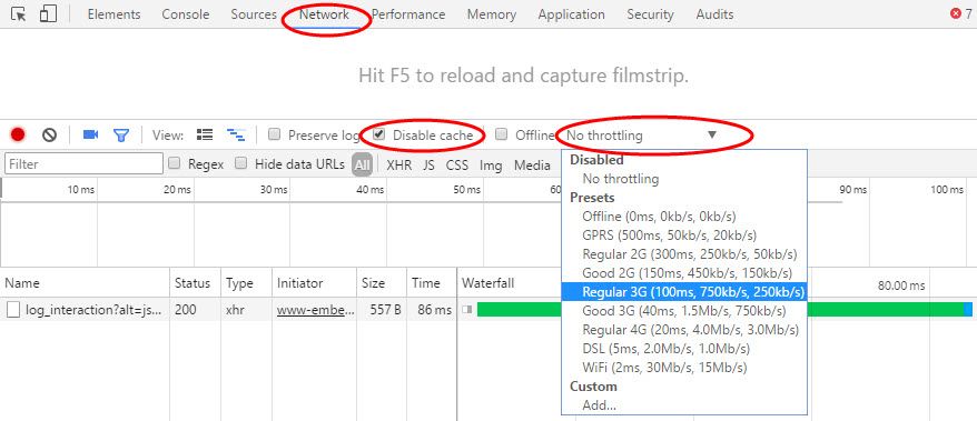
Next, hit F5 to reload the page and examine the waterfall report which will highlight elements of the page such as CSS, JS, and images that take longer to load. This will help you to prioritise fixing the elements of the page that are slowing it down the most.
5. Test for Mobile-Friendliness
Responsive does not necessarily mean mobile-friendly in all cases. Google will recognise issues that devalue user experience on responsive web pages and will rank pages accordingly. Buttons too close together, images that do not scale, and overlapping page elements are a few issues that can occur on responsive pages. For this reason, test the user experience on multiple devices, operating systems, and screen sizes, while also leveraging online tools such as Google’s Mobile-Friendly Test.
Looking at current website performance based on the various devices used is a good way to find out if any specific devices are problematic for the website. In Google Analytics, the “Audience>Mobile>Devices” report will allow you to observe user-engagement metrics such as bounce rate, session duration, pages/session, and conversion rates to see if any particular device deviates significantly from site averages. This is especially important for popular devices that drive a good amount of traffic to the site.
Once you can confidently confirm all the above checklist items are up to par, you have achieved the minimum required to avoid a disaster when the mobile-first index completely rolls out. Now you can focus on the hundreds of nuanced SEO elements that will place your website above your competition in organic search. Remember, if the intent behind any search query cannot be satisfied on a mobile device, the desktop experience is obsolete.
Screenshots by Marc Purtell. Taken July 2017.