


Analytics in the real world is often a dirty and confusing affair, because getting it right is always more than just dropping technology onto a page and building reports off the data surplus.
The recent re-branding of Google Analytics Premium as ‘Analytics 360’ within Google Analytics Suite is enough to stress the same as above by tech giant Google. In a nutshell, Analytics 360 is a ‘data goldmine’ for marketing people and the following are the top five ways that marketers can master it.
Multi-channel integration (online & offline)
Google stack integration is one of the USPs of Analytics 360. It’s now possible to bring together all of the data from a range of channels (paid search, display, CRM, TV, radio, etc.) within Analytics 360 to get an overall view of user journeys and behaviour across various channels.
Digital marketing has allowed businesses to interact with users via many different channels – search, display, social, email, etc. They’re always looking to better understand how one channel impacts another channel, or how users interact and behave when they move from one channel to another. That’s where attribution modelling within Analytics 360 comes in handy. But in some situations you might want to take a direct action, or even automated action, in a channel based on user behavior in a separate channel.
For example, you may want to change your display strategy for specific users on your email list. Perhaps you want them to see different display creative because they might fit better being lower in their purchase funnel or you have a better relationship with them (social follower).
Analytics 360 allows to you do the above by integrating your online-offline data together either via data imports (as below) or via measurement protocol (official video from Google).

Explore the multi-device digital world
Analytics 360 allows you to connect various devices together to get real insight at device level and better understand how users are behaving on which device at what stage of the purchase journey.
One of the fundamental features of Analytics 360 is a user-centric measurement. This includes measurement across multiple devices – computers, smartphones, tablets, etc. Most of the analytics tools set an anonymous identifier to measure users. On websites the JavaScript code creates the identifier and stores it in a cookie. On mobile apps, the SDK creates the identifier and stores it in a database on the device (Google calls this default ID the ‘Client-ID’). However, to do cross-device measurement, we need to use the concept of user-ID which overrides the default Client-ID behaviour.
Here’s a brief overview for implementing cross-device measurement.
- First, you need to “turn on” the user ID feature for a given property.
- Second, you need to add the actual user ID value to the data collection. For websites, this means you need to modify the JavaScript tracking code. For mobile apps you need to change the SDK.
- Third, create a User-ID view. This is a special data view that includes new reports.
Once done properly, you should be able to see the below reports.
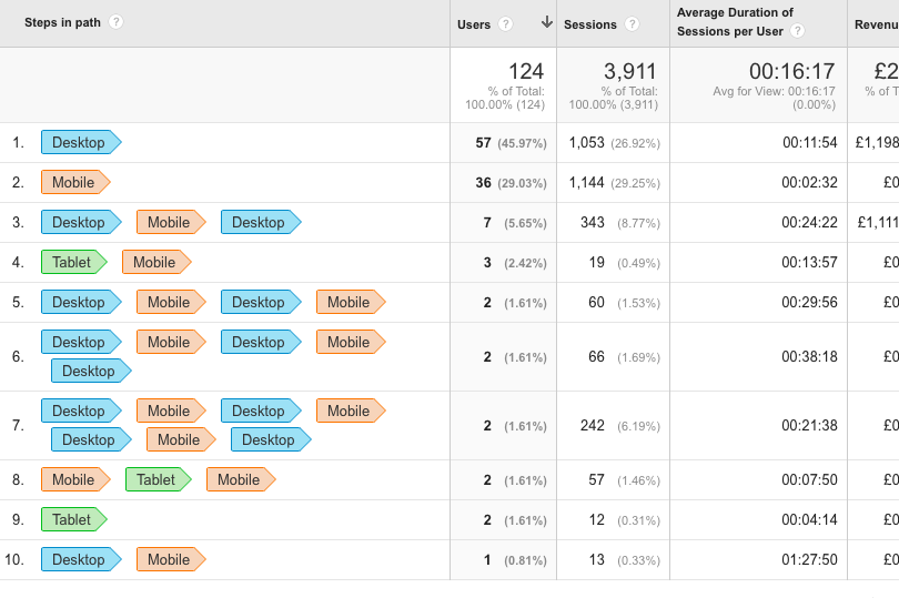
1. Device overlap reports

2. Device path reports
Custom-made dashboards
Whether you are CXO or VP, there is a report for everyone at every level. From top-level performance numbers to more granular details, custom dashboards allow access of the data for the right people at right level.
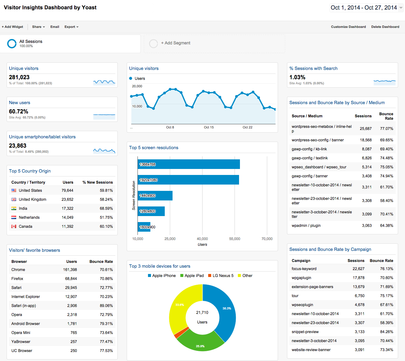
Google Analytics dashboards are simply collections of some interesting widgets that allow you to quickly visualise your data including reports and metrics you care about most. Dashboards let you monitor many metrics at once, so you can quickly check the health of your accounts or see correlations between different reports. Dashboards are easy to create, customise and share.
Each Google Analytics account can contain up to 50 shared dashboards per view with 12 widgets in each dashboard. Please note that each view / property includes a default dashboard to get you started. An example of simple birdseye-view type of dashboard is shown below.
Build the audience
One of my favourite, unknown but very powerful features of Analytics 360 is that it allows to build/develop your own audience (using all the integrated data) which can then be used for not just remarketing/retargeting campaigns but for testing and optimisation too (with wider Google Analytics 360 Suite).
Custom audiences are for those who want to do more than just using ‘returning users’ segment. And want to define more specific audiences based on characteristics (such as traffic source, device, or geographic location) or by behaviour completed or not completed (such as page viewed, event recorded for video start or offsite link, or e-commerce transaction). Once you understand the science behind the scenes, custom audiences can help to optimise overall conversions using some of the following.
- Using the Remarketing Audience in an AdWords Campaign.
- Using Remarketing Lists for Search Ads (RLSA).
- Using Remarketing in DoubleClick.
- Using Smart Lists and Similar Audiences.
- Using custom audiences for Dynamic Remarketing.
Big data analytics
Yes, you are right! Analytics 360 allows you to dice and slice the most granular level of data (impressions) using Google BigQuery integration within the platform and do some really interesting and advanced analytics via statistical modeling techniques.
Analytics 360 + BigQuery means you can have full-resolution Google Analytics logs automatically imported to your BigQuery project (several times each day). This data can then be used to realise predictive digital marketing – with better insight into your customers’ activities.
You may be asking yourself the question: “I already have Analytics 360, why do I need BigQuery?” The answer is very simple; BigQuery offers a data analysis service (fully-managed) that’s fast and scalable for big data analytics. BigQuery also allows your organisation to gain advanced customer insight by combining multiple data sources and performing advanced statistical modelling/analysis using unsampled Analytics data which enables hit-level analysis returning your results in seconds (not hours!).
A perfect example of the above is visualising your Twitter data in Tableau via BigQuery in combination with site behaviour data from Analytics 360 to understand the rich insightful information about how users are behaving and to make sure that we provide optimal user journeys across different touch points.