


In October 2015, Amit Singhal, senior vice president of Google Search, announced that over half of the 100 billion searches conducted on Google each month come from mobile devices.
Of course, this means that optimising your website to ensure the best possible mobile experience is as important as ever. You want users to be able to find content easily and reach converting pages quickly. But how well does your site perform on mobile devices? How do you analyse mobile search data? Here are some tips that will help you improve your site’s SEO performance on mobile.
1. Analyse mobile search behaviour for your business
Users search differently when using their mobile devices; according to Search Engine Land 62% of organic searches show different results on desktop and mobile. This means that it is vital to understand the difference in what information users want when they are on different devices. Google data shows that in the last year ‘near me’ mobile searches have doubled and 82% of smartphone users consult their phones on purchases they are about to make in store.
To gain insight into the differences in device search behavior you can use a variety of tools, but here are some of our favourites:
- Google Search Console shows the search queries that drove people to your site when users searched on their desktop, tablet or smartphones. It also shows other insightful data such as impressions, CTR and the position that your site appeared for. By using this data, you can gain insight into how users search for your company’s services and how your site performs across desktop, tablet or mobile.
- Searchmetrics have launched a ‘Desktop vs Mobile’ report (currently in beta) which provides insight into a site’s SEO Visibility on both desktop and mobile. This helps you understand how big the overlap is for your site between desktop and mobile. The report shows mobile rankings, mobile rankings ‘winners and losers’ for a certain date, and local mobile rankings for London, Manchester and Birmingham. This is just the beginning and we expect more features to be rolled out as time goes by.
- Ranking software such as Advanced Web Ranking (AWR) is another useful tool that allows keyword tracking for a site across both mobile and desktop. Apart from different mobile user agents, AWR reports also provide local results for mobile and the option to compare your performance against your competitors.
2. Know which search queries display local results
In December 2014 circa 7% of search terms had maps integration in search results – this percentage has increased over 2015 due to the rising importance of local and mobile search queries. Due to this it is important to optimise your site’s visibility for local results. However, is there a way for us to know which keyword triggers the local pack in search results?
Searchmetrics provides which queries make your site show in local results and your site’s position in the local listing. It also provides other data such as the URL that ranks for that given query, the average search volume for the keyword and the amount of traffic this keyword has potentially driven to your site.
AWR will also allow you to see the SERP which was retrieved at the moment the report was run. It will not only provide the position of the given keyword but will also let you see if that keyword triggered images, maps, etc. and if so, which sites are appearing for those results.
3. Optimise local listings
A great deal of searches performed on smartphones happen on-the-go. Joint research by Google and Ipsos MediaCT shows that up to 56% of these searches have local intent, as people looking for a business or product are interested in results that are local to them. This means that optimising your site for local search is vital. In fact this study showed that 66% of these mobile searches specifically relate to finding the closest store stocking a product.
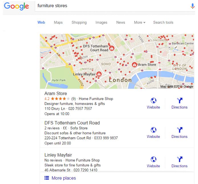
Providing as much relevant local information as possible is also important in terms of search real-estate as Google now only displays 3 local results instead of 7 as shown below:
4. User experience and mobile
Google has always emphasised the importance of providing a good user experience to mobile users. This took a step further on the 21st April 2015 when Google launched its Mobile Friendly update – or as some publications were calling it: Mobilegeddon.
This update promised to target sites that gave a bad user experience on smart phones and potentially remove them from Google’s mobile search results or reduce their rankings. When you consider that more than half of all Google searches are done on mobile devices, this is potentially a large volume of traffic to lose.
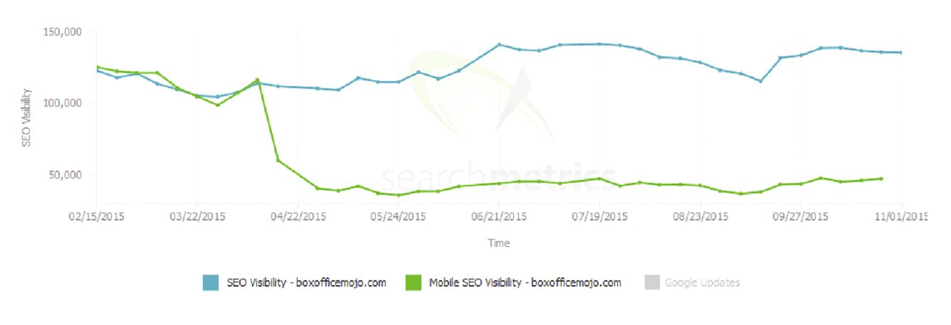
A few months down the line and we can see that the overall impact of Google’s mobile update was not as big as many thought it would be. In fact Searchmetrics data shows that the loss of rankings for the non-mobile friendly sites in their data set was 0.21 positions on average. Google too stated the impact was not as large as expected, but speculated that a lot of webmasters improved their mobile experience after the pre-warning of the forthcoming algorithm update. On the flip side of this, there were a number of sites which offered a poor mobile experience such as the example below where significant performance decreases were dished out.
The fear factor in the lead up to Mobilegeddon combined with clear data trends highlighting the switch to mobile led many brands to finally understand the importance of a site that provides a good user experience to its mobile visitors. Many websites have either now gone responsive (Google’s recommended option), created a mobile site on a subdomain (m.example.com) or used Dynamic Serving to meet Google’s mobile requirements.
So, how do you improve your mobile SEO performance?
A consumer centric approach to search marketing is key to understand users’ behaviour when browsing online across different devices and to understand how your site performs across desktop, tablet and mobile. Having great ranking results on desktop doesn’t mean your site performs as well on mobile.
What’s also crucial is using relevant insight tools such as the ones mentioned above to analyse and interpret search behavior across devices for your site. Using this information alongside performance data will enable you to adjust your strategy and make the necessary optimisations to improve your SEO performance across mobile. The screens may be small, but the opportunities are huge – don’t miss out!