


As you will know, Google has changed its algorithm to focus on making sure that sites that do not pass their mobile friendly test will not achieve as high a ranking in mobile search.
Although this is a logical step, it is going to cause mass upheaval. According to Search Engine Land, 40% of the top websites in the world are not mobile friendly; where have they been?
Even if your site is mobile responsive, it may still have things that do not pass the mobile friendly test.
We suggest you use Google’s mobile friendly checker and follow the steps below to survive the update.
1. Check for blocked resources
Have you blocked any CSS, image or javascript files from Googlebot? A lot of webmasters think that this will give them a cleaner showing in the search engine results. This may be the case, but Google needs to see these files in order to determine if your site is mobile friendly.
Your robots.txt file should be added at the root directory level and be found at domain.com/robots.txt.
As you can see from looking at ours, we have only excluded some internal files from Googlebot; these are fine.
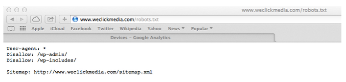
If your robots.txt file is hard to find then you should be able to access it in Google Webmaster Tools. Look for what appears after “Disallow:”
2. Check Googlebot for Smartphone can access all of your pages
Even if you know your site is responsive, you still need to check that Googlebot can access all of the content.
Use Google Webmaster Tools to ascertain how Googlebot for Smartphone sees your page.
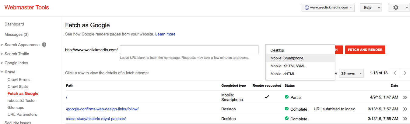
Select Mobile: Smartphone to see how Googlebot sees your website in i0S and Android devices. The XHTML/WML option is for older phones with a web browser.
Add your URL in, or leave the field blank if you are checking the homepage only, and click “Fetch and Render”. If you see anything other than “complete” below the “status” heading then there is something that is being blocked from Googlebot.
Interestingly, you can also see the difference between how you see your page and how Googlebot does.
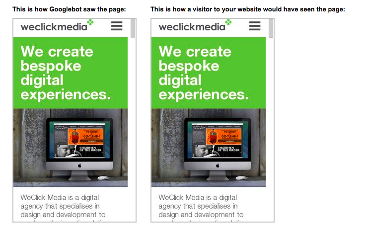
In the case of our website, we had one snippet of javascript blocked, which we rectified.
3. Make sure you avoid duplicate content issues
If you have a mobile version of your website that is separate to your main site, you will need to check that you have the right tags installed; this avoid duplicate content issues by letting Google know there are alternate versions of pages.
Do this by:
- Adding a rel=canonical tag to the mobile version of the page that points to the desktop version. NEVER do this for pages that do not have the same content.
- Adding a rel=alternate tag to the desktop version that points to the mobile version. Google then knows the mobile version of the page is just another version rather than a separate page.
Even if your site is fully responsive, make sure you have set your viewport correctly and added the “meta viewport” tag. Google’s mobile friendly tool will flag this up if it’s not right.
4. Put user experience first
Google prides itself on providing websites that give users a good experience; this is the backbone of every single algorithm update since the beginning.
Even if your site is responsive, make sure:
- Your links are spaced far enough apart for easy “tapping”.
- Your font size is large enough to avoid the user needing to zoom in; point size 12 (the equivalent of 16 CSS pixels) is ideal. Also have a 1.2em vertical space between characters.
- Your buttons should have a height and width of 7mm or 48 CSS pixels.
- You avoid the use of Flash and other software that doesn’t work well on mobile.
It is also important to make sure that users can access content quickly and easily, they should not be waiting more than a second for a page to load or be unable to see images properly, for example.
5. Treat the mobile experience as mainstream and not alternate
Don’t fall into the trap of treating your mobile website like an optional add on that doesn’t have the same qualities as the desktop experience.
Webmaster guilty of this will often just stick a “rel=canonical” tag on the mobile site that points everything to the homepage or leave off everything but vital company information. In a world where 50% of your traffic will be from mobile devices, this is just not good enough.
So, there we are, hopefully this will help you get your site ready for one of the biggest algorithmic shakeups to date.